

Chanel J12 GMT Chromatic, review.
“This is a man's world... this is a man's world...” James Brown's famous song begins with these deep lyrics.
He could have added an extra verse on the horologic web, as it is such a virile world. Beyond a certain point, the testosterone level impairs one's vision. And one has to admit that all of us missed a major socio-horologic phenomenon: the Chanel J12. One has to say, from fundamental debates on the Speedmaster's lugs to passionate brawls about the Luminor's Unitas, we missed the J12.

For watch lovers, this series suffers from two major handicaps: on the one hand, theses models are creations outside of male standards; the J12 was never a downsized masculine icon featuring stones and a quartz movement. One never saw Steve McQueen covered with soot or Stallone cover with mud wearing a J12...
A sign of our times, the opposite occurred: rather female oriented when it was released, some men appropriated this watch. On the other hand, it does not come from a prestigious Swiss watchmaking house, despite its mechanism worthy of its Romand competitors, especially thanks to Valjoux or Audemars Piguet calibers...
For that matter, the paradox is this animosity towards the fashion brands which produce watches.
From a horologic web's standpoint, and despite the true qualities of these watches, mainstream luxury and fine watchmaking seem to be antithetical.
However, the bottom line is that the J12 is indisputably a big player: it is a true success, it features an emblematic design with innovative materials and Swiss made calibers.
While Jacques Helleu created this J12 for himself, he nonetheless achieved the synthesis of past and future trends.
Presented in 2000, the watch was an immediate success in the female print media; after some successful marketing campaigns, it became a case study of a success that left nothing to chance.
The great aesthetical innovation for a dressmaker's woman's watch was to propose a sport-chic design, which allowed for a revamping of this market. When he designed the first J12, Jacques Helleu understood that times had changed.
This J12 arrived strategically at the moment when the Rolex Submariner, as it gentrified, lost some of its aura to even more military-vintage brands, like Panerai. Akin to Blue Jeans, which became definitely tighter when it was reinterpreted by women, the design of the ultimate diver from the 60's evolved into something feminine, when it became more refined and took on a shimmering ceramic.
This wear-proof material features a significant psychological advantage for a 5000€ watch: everyday, it will look brand new, contrary to the products fathered by the disposable-rag cartel...
Since women haven't passed the more-than-vintage demarcation yet, the place where one bleaches one's glasses insets with tepid chlorine, the unalterable ceramic came right on time.
Coco Chanel utilized three emblematic colors in her creations: white, black and beige.
Initially, the J12's ceramic was available in two colors:
Black, a color which retains its aura, as it is the style's lowest common denominator;
White, which was the true innovation of the J12: offering an immaculate and inalterable color, whereas in the past women's watches with white leather straps aged prematurely and badly. The white J12 was such a success that this color became somewhat sullied: from Technomarine and Hublot to countless sub-brands, everyone reinterpreted white ceramic.
Beige: Surprisingly, Chanel still does not use this color. Yet, a matte beige ceramic J12 would have huge potential, surfing on the trend of camouflaged dress.
The novelty we are going to talk about is the J12 Chromatic GMT, a synthesis of white and black: drum roll... Grey.
For a long time, grey was reserved for the top level of fine watchmaking; the Grand Complications of the most prestigious brands featured platinum watch cases, made even more discreet by sober grey dials.
These where the ways of Helvetian Calvinism, an overabundance of finishes enclosed in a super-luxurious watch case, with the sobriety of a liberal arts 70's professor. The trend changed a few years ago: one began to find brands who defied the unspoken rule, by proposing grey dials in stainless steel cases...
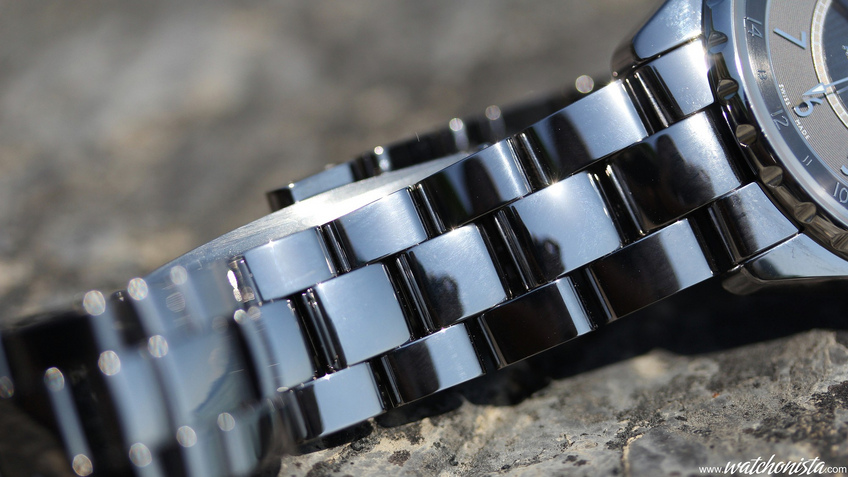
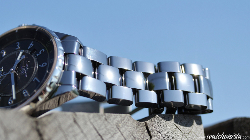
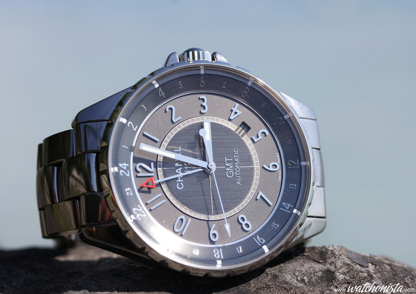
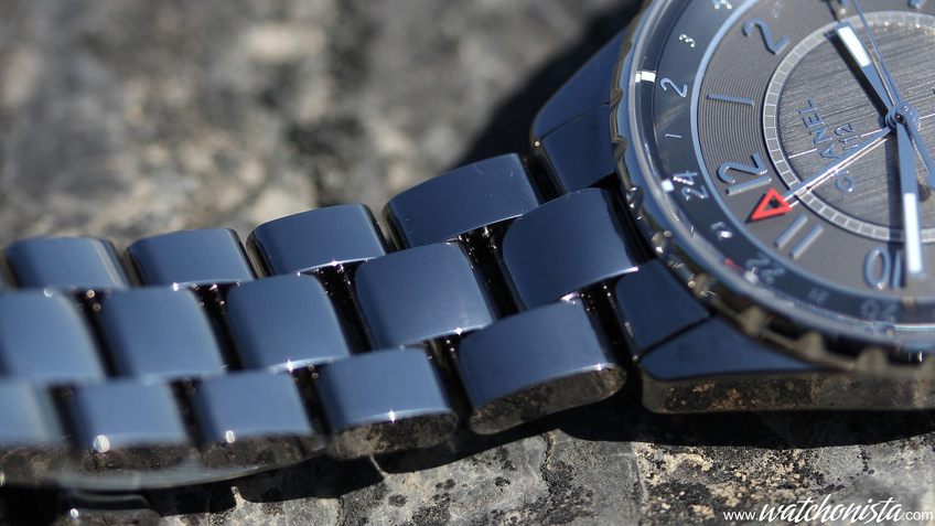
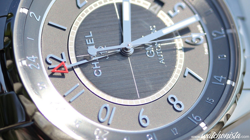
But the J12 Chromatic further pushes the grey revolution. The color balances between medium-grey to sky-blue, depending upon the reflections. It is almost the missing link between matte grey and the polished titanium metallic grey. The bracelet links could serve as pocket mirrors, as they reflect light so vividly. Depending upon the lighting conditions, the watch is versatile. Without even looking at the hands, one can approximately tell time based upon the type of reflections on the bracelet. The "liquid metal" effect is quite intense and very impressive; however, the downside of all the polished bracelets is fingerprints; one must keep a soft piece of cloth handy at all times.
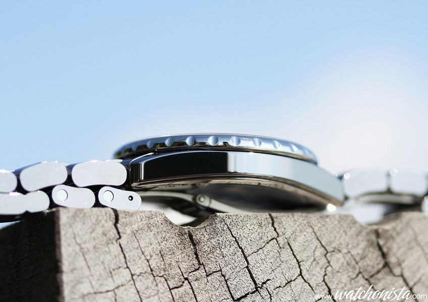
To achieve this effect, titanium powder was added to the 41mm ceramic case, the overall piece being polished with a harder material, in this instance diamond coated mills...
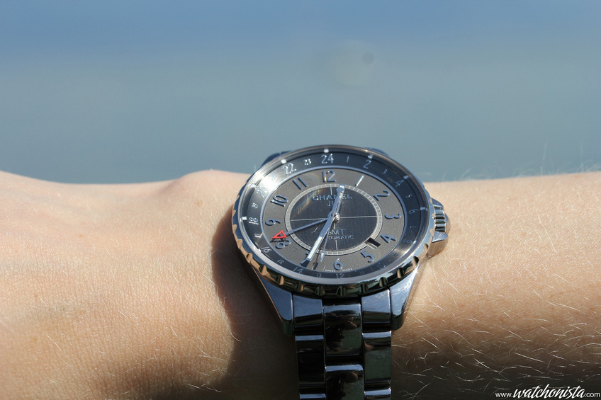
If the aspect is surprising, so is the touch and feel: The watch is super-light, undoubtedly too light for watch-lovers, because when one lifts a piece with a metallic bracelet, one puts a certain force in ones gesture, anticipating the mass/volume ratio of stainless steel. But in this case, I had the same feeling I experienced with the RM027 "Nadal", a watch whose weight does not match the look. The women keen on comfort will be delighted, as the watch is so easy to wear...
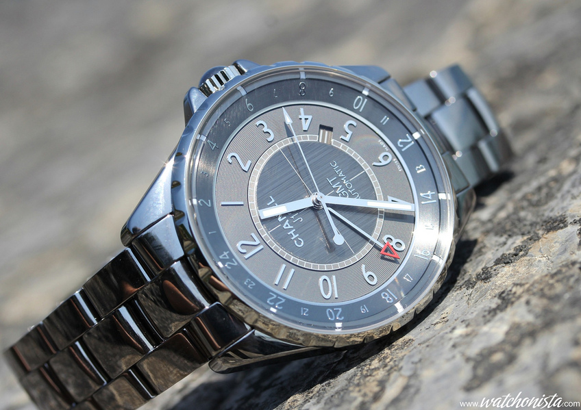
Aside from the material, the other major evolution of this model is of course the transformation of the bezel. Until now the whole range featured a thick graduated bezel, like that of a classic dive watches; the J12 Chromatic unveils a thin bezel and a beveled chapter ring, like some vintage dive watches such as the Polaris or the Kon-Tiki.
Is it a new stylistic turn? In any event, it was a surprise when we unpacked the watch. With its generous aperture, it looks large enough on the wrist and a bit dressier that the traditional J12. Will the female customers respond positively?
Very likely, as thin bezels with large chapter rings are always a success with new customers of fine watchmaking, as demonstrated by the success of the Navitimer... This chapter ring is fixed and features 24 applied indexes, for as many time zones.
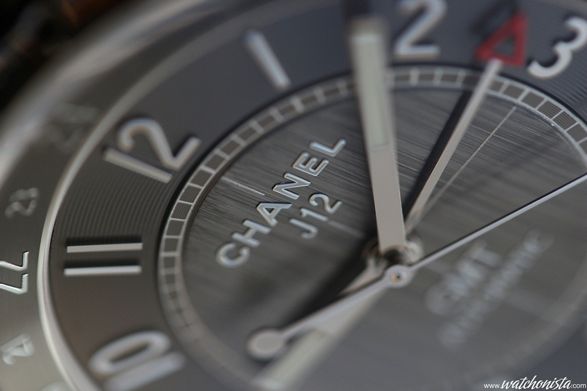
The dial also features applied indexes, but substantially larger. It may not sound like much, but it shows a series of quite demonstrative finishes: circular brushing, mirror finish, circular graining, railroad and vertical brushing.
This demonstration would almost deserve a "user's manual", to educate female customers about the types of finishes and the techniques used to achieve them.
Finally, let's talk about the caliber: Chanel communicates very little on the subject, but one knows it is a Swiss automatic caliber featuring a 42-hour power reserve. Therefore, on can presume it is a series 28-XX Valjoux layout, with an extra hand for the second time zone.
This J12 Chromatic GMT is a successful evolution of the J12; it was a challenge, since it is always tricky to make an icon evolve without sinking into self-caricature. The J12 is a commercial success, the watch is finished and powered after the fine watchmaking standards, and the icon smoothly evolves.
It seems the only challenge Chanel horlogerie will have to face is to educate women in fine watchmaking, by explaining the amount of work it takes to produce a J12. Hence, in a few years one will have the privilege to see thousands of watch-loving women land on watchmaking forums...


