Fun With Fonts: Typography’s New Maximalism
Opinions
Fun With Fonts: Typography’s New Maximalism
The next generation of independent watch brands is using creative design as a form of expression.

By now, you’ve noticed that Watchonista has updated our logo and wordmark. In fact, the whole site has been refreshed to reflect how our community has changed since we started in 2009. It’s meant to feel bold, emotional, and modern, while still feeling handcrafted to honor the history of watchmaking. My point is: A lot of thought went into this redesign.
And change is coming to every corner of culture. A few weeks ago, I attended a Q&A with the famed chef, restaurateur, and food writer Yotam Ottolenghi. He is currently on a book tour for his latest cookbook, Simple Too. This collection of easy-to-make recipes follows up on the 2018 bestseller Simple.
What does this have to do with watches and typography? The moderator asked Ottolenghi how this book differs from the first edition. His response was, simply, “We are not the same people we were ten years ago.”
We are also seeing these societal changes manifest themselves in typography. For instance, Instagram recently changed its wordmark. And who can forget the kerfuffle when Cracker Barrel rebranded?
While there’s no common name for this movement (remember, it wasn’t until the 1960s that the term “Art Deco” came into common use to describe the decorative arts of the 1920s and ‘30s), the following brands are using new flavors of fonts to usher in a new era of emotion.
Paulin
Yes, typography is taking on a bigger role in watchmaking in 2026, moving beyond pure legibility and into storytelling. Brands are venturing into using custom fonts, oversized headlines, motion, and layered styles to make a big impression.
Founded in 2013, Paulin is ahead of this trend. The Glasgow, Scotland-based brand has used bespoke typography, designed in-house or in collaboration with an artist or designer, since the get-go.
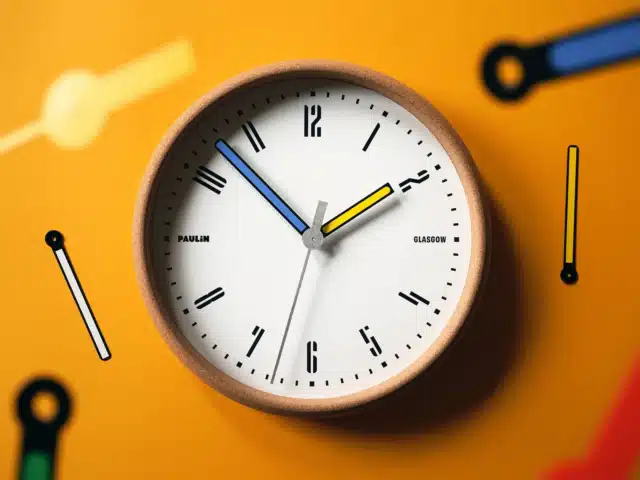
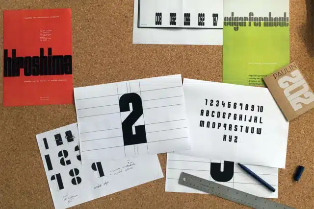
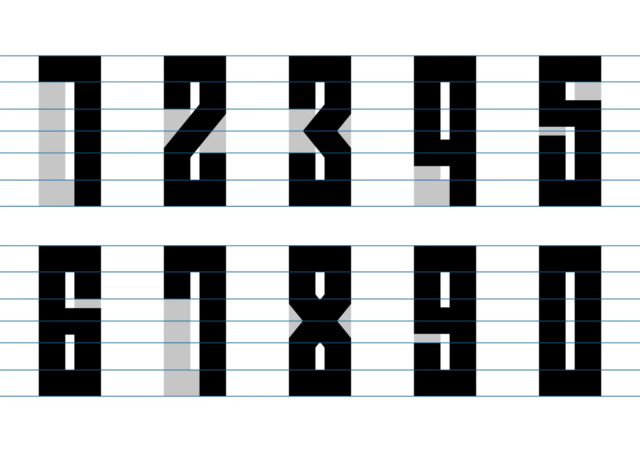
Paulin’s flagship font, Wim, was developed by in-house typographer Imogen Ayres (who was inspired by the postmodernist and purist grid systems created by Dutch designer Wim Crouwel).
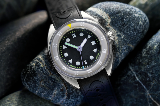
This typeface has proven surprisingly versatile, appearing first on the time-only Neo, adapting well to its GMT versions, and jumping from dial to bezel on the Mara dive watch.
However, while the Wim font is a celebration of the grid, in 2024, Paulin went completely freeform by collaborating with James Edmondson of San Francisco’s OH no Type Company to mark the brand’s visit to San Francisco for the Windup watch fair.
As you can see, with this font, the dial is completely covered in colorful bespoke numerals. Born over a decade apart and looking completely different, it’s still clear that Paulin is the parent.
Brew
Online, designers are moving toward expressive typography. You have no doubt been noticing this on everything from landing pages to navigation on your favorite websites.
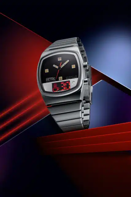
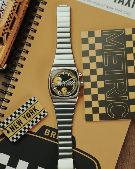
It’s fitting that the microbrand Brew has been able to translate this trend onto a watch – the Metric Digital Blend Analog-LED Watch. But before we jump into this watch, let’s back up a bit.
Born in 2015, Brew’s aesthetic comes from coffee machines, not watches. So, it makes sense that its visual language comes from industrial design.
Originally, the numbers and letters on a Brew seemed meant only to impart information. With each addition to the catalog, Brew adds more information to the story, and the Metric Digital Blend Analog-LED Watch is the most captivating chapter yet.
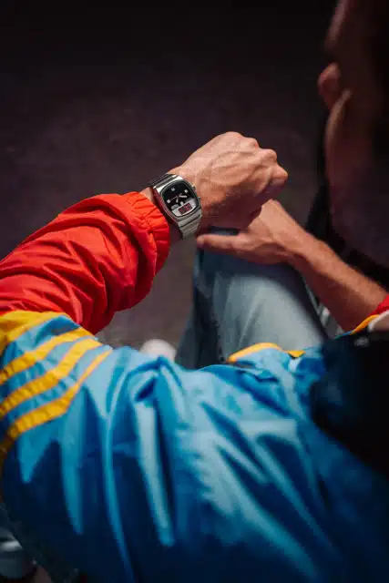
Here, the model name and its function are spelled out in a modernist, sans serif font. But what makes it so very of-the-moment is its playful LED display, which features a 30-second countdown clock with an animated percolating coffee cup to let you know when your shot is ready.
Buci
Minimalism isn’t going anywhere, but maximalism is starting to turn up in timepieces with rich colors, overlapping visuals, bold fonts, and clever compositions. Mirroring this emerging trend toward maximalism, Buci’s new Nouvelle timepiece, recently launched at Geneva Watch Days, was inspired by the literary form of the short story.
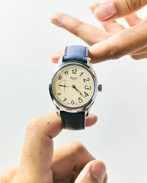
Buci founder Nousseïma Baraket told us that if her first collection, Garde-temps (2022), was a poem, Nouvelle is a short story that casts everyday moments in a new light. And at first glance, this watch’s structure is minimalist, but as you delve into the design, the details take over.
First, the sides of the case are grooved like the pages of a closed book. Second, as with Buci’s previous models, the dial has a papery texture. Then, the hands are shaped like fountain pen nibs. Finally, a small seconds sub-dial counts fragments of time, reminding us that life is shaped not only by its defining milestones, but also by its quieter moments.
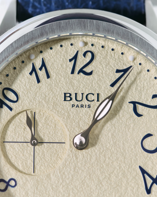
That said, it’s the Nouvelle’s numbers that catch the eye. Baraket worked with a French calligrapher to capture the emotive quality of a handwritten first draft of a short story, suggesting that the wearer’s story is still being written. “With Nouvelle,” says Baraket, “I wanted to invite people to look at time differently: through the simple moments, the details that surround us, and those moments we choose to notice.”
While the next logical step in the Buci story would be a horological tribute to the novel, the Nouvelle is now available for preorder.
Camp Watch
We first met California-based Justin Jakobson at the Vancouver Timepiece Show in 2024. The industrial designer had just launched Camp Watch, a delightful collection of playful watches inspired by his memories of summer camp in Michigan.
If you never attended summer camp, Jakobsen’s dials appeal on a different level. Mainly, its typographic maximalism.
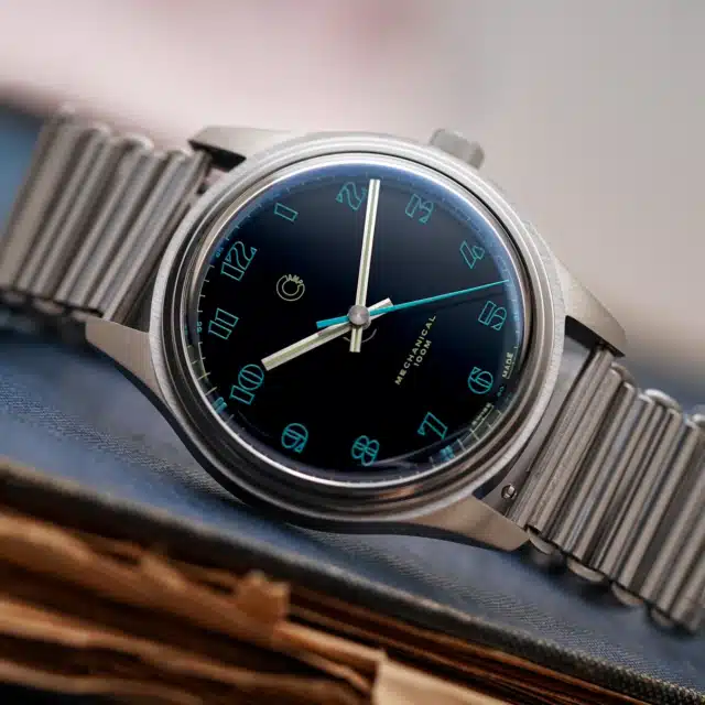
Currently, Camp only offers one model – the Fieldtimer Manual Wind. That model comes in three colors (Atlantic Blue, Florida Green, and Málaga Red), with each dial composed of 15 layers of oven-cured, hand-polished lacquer for unparalleled depth of color.
Here are a few more numbers: Jakobson has created three distinct numeral designs for each edition. That’s right, three fonts that can be found nowhere else.
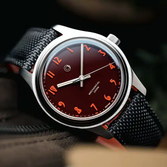
Across the board, typography has become more performative and more central to brand expression. Counterculture collectors gravitate toward micro brands because they don’t want a watch that looks like anything else. And Camp is picking up on that energy.
Héron
Since setting up shop in Montreal in 2021, independent watchmaker Héron has quickly built a solid following for its tool watches, specifically its Marinor diver and the Mirabel GMT.
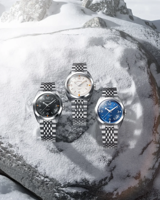
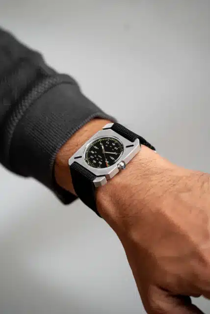
Perhaps it’s because microbrands are not so tied to tradition; they are more willing to play around with display. With its most recent launch, the Continental, Héron has created an elegant time-only watch with rugged tool-watch construction. And helping it break the rules (or build a bridge between a tool watch and an everyday-wear watch) is its typeface.
Just as type designers are looking for ways to code-switch between physical and digital worlds, the Continental’s numerals reference classic adventure watches from the past while giving them a new purpose. More specifically, the hour markers are cut out sandwich style to show a lumed layer underneath.
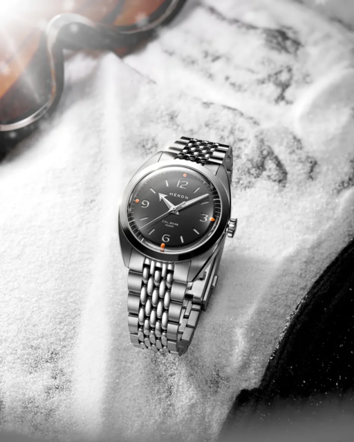
The Héron team says that Continental “is inspired by the watches worn during the great age of exploration, when mountaineers pushed higher than ever before, scientific breakthroughs reshaped modern life, and international travel brought distant horizons within reach.” But this mix of sporty signatures also reminds us of cut-and-paste, handmade zines from the 1990s. In fact, the stencil-like cutouts remind us of punk rock, pre-AI concert posters.
Final Thoughts
To bring it back to Ottolenghi, “Simple Too is less about doing less – and more about making every day cooking feel generous, achievable, and full of joy.”
Likewise, these microbrands are using typography to make their timepieces tastier.
Advertisement