TimeForArt Auction Spotlight: Gerald Charles x Igor Mitoraj Luci di Nara

In-depth
Text & Context: A Roundup of Font Forward Timepieces
Hermès, Chanel, NOMOS Glashütte, Tudor, and Franck Muller have all made unique contributions to the way we read time.

Typography nerds will have noticed a shift in watch dial design. While some luxury brands are still sticking with tried-and-true fonts such as ITC American Typewriter and Arial (Patek Philippe), Garamond (Rolex), and Times Roman (Audemars Piguet), others have been quietly introducing custom fonts.
Here’s a roundup of some of the most interesting and influential typefaces on the market today.
Slim d’Hermès
First off, fonts and typefaces should never be an afterthought in watchmaking. On a practical level, they make it easier (or harder) to tell the time. But like words on a page, they also help tell a story. Take, for instance, the Slim d’Hermès.
Because the Slim d’Hermès is a simple, time-only wristwatch, an off-the-rack typeface would be glaringly obvious and horribly incongruous to the eye. (Side note: This SNL sketch is an excellent summation of how scroll-down font choices can drive a person crazy.) Thus, the Slim d’Hermès watch is a wonderful example of a watch that strikes the right balance between the two objectives.
[video:https://www.youtube.com/watch?v=jVhlJNJopOQ]
When it was introduced in 2015, Hermès commissioned French graphic designer Philippe Apeloig to create a whole new font for the hour markers of this time-only watch. Apeloig, whose work is enshrined in The Museum of Modern Art in New York, not only created a typeface that was unique to the Slim d’Hermès but also to existing typography.
The sans-serif Slim d’Hermès numbers employ a combination of straight and curved lines, with no variation in line thickness (most typefaces use a mix for contrast and legibility). Moreover, each number (except 1) features fine breaks in these lines as a nod to both the case’s skinny silhouette and the super-slim movement that powers the timepiece.
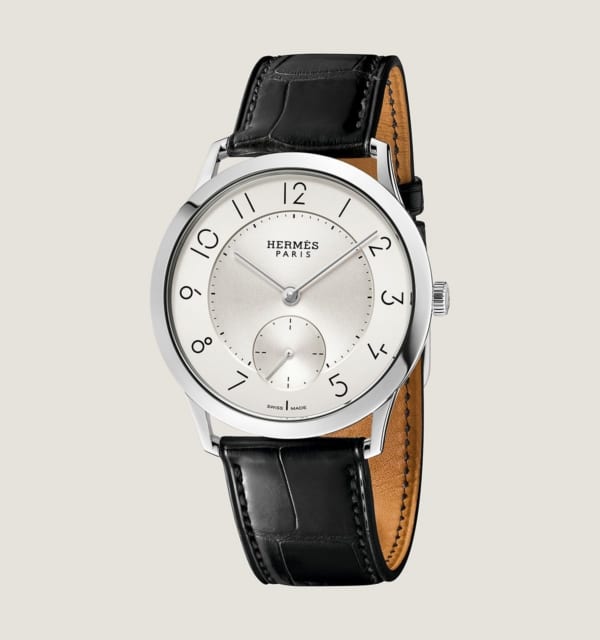
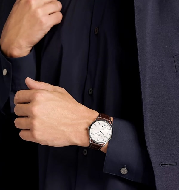
Hermès is also a brand known for its aesthetic sensibility, so its attention to typography only underscores the Maison’s history. The result is a display that is both unconventional and elegant.
Chanel Monsieur
It should come as no surprise that timepieces from fashion houses like Hermès are leading the way for bespoke typography.
When it launched its Monsieur collection in 2016, the director of Chanel’s Watchmaking Creation Studio, Arnaud Chastaingt, created custom numerals for this utilitarian timepiece.
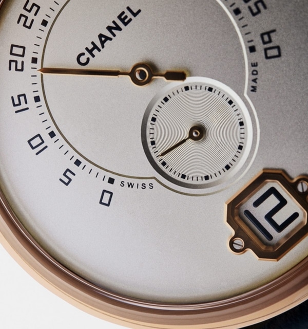
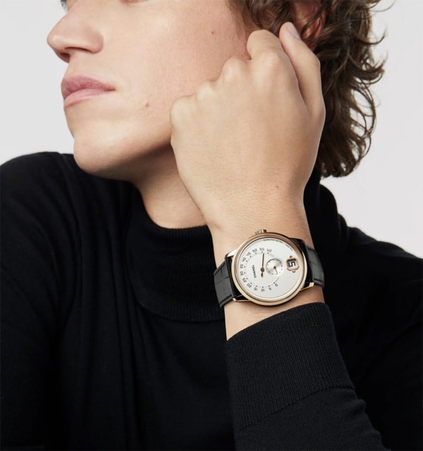
The Monsieur was also Chanel’s first men’s watch. In an interview with Hodinkee at the time, Chastaingt said, “I wanted a typography that was structured, taut, rigorous, bold, and echoing the drawing of digital numbers. My objective was to create a typography that illustrated my vision of a masculine spirit according to Chanel, of an elegance defined around the notions of power and discretion.”
The Monsieur was also the first timepiece produced after the brand bought the G&F Châtelain workshops in La Chaux-de-Fonds. So having a brand-new typeface also announced Chanel’s horological independence.
NOMOS Glashütte Tangente
For a minimalist watch, details such as the typeface become even more critical. Case in point: NOMOS Glashütte.
For you see, while the Slim d’Hermès and Chanel Monsieur use custom typefaces for numbers, they do not use them for brand logos; NOMOS Glashütte’s design language is pretty much consistent across its catalog, which helps make its low-key details more readily recognizable.
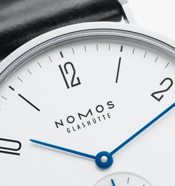
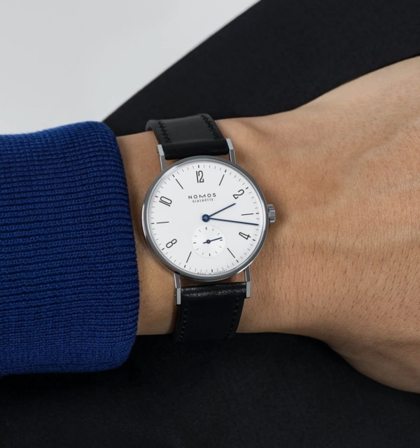
NOMOS’ type style derives from the Bauhaus, a German school of art founded in 1919 with the goal of bridging the gap between fine arts and mass production, and it later became one of the modernist movement’s more influential styles (think Albers, Kandinsky, and Klee).
But the NOMOS look is not derivative. In 1990, Roland Schwertner, the founder of NOMOS Glashütte, stumbled upon an old Glashütte dial that, although it dated back to the 1930s, had a contemporary feeling. Graphic designer Susanne Günther was then given the task of reinterpreting this dial to suit a wholly new case. This watch came to be known as the Tangente.
All the collections share the brand’s logo with the elongated “M” in the NOMOS signature. At the same time, no two NOMOS watch families are alike. Although the Tangente, Tetra, and Ahoi fonts share a design, they take different approaches to the minute track, numerals, and spacing. That is because NOMOS believes design is a dialogue between all parts of a watch and its wearer.
Tudor Monarch
One of the most popular genres of storytelling is speculative fiction. This form encompasses any narrative that explores hypothetical concepts, futuristic technologies, and alternate histories. Basically, it poses the question “what if?”
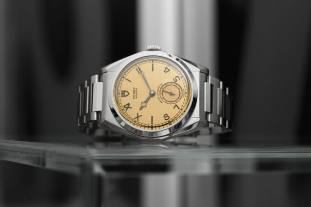
With its papyrus-toned dial, a mix of Arabic and Roman numerals, and a small seconds sub-dial, the Tudor Monarch is a tribute to the style of the 1920s, when Rolex founder Hans Wilsdorf conceived the brand as a more accessible alternative to his main line. But the typeface of the Monarch never existed in the past.
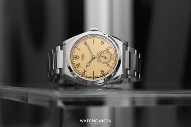
In fact, to celebrate Tudor’s 100th anniversary, it wanted to create a present for its collectors. But rather than reissue a specific Black Bay model from the back catalog, the brand decided to whip up a watch that is a pastiche of the maison’s many eras.
The “California dial” (or “error-proof”) watch face didn’t appear until the 1930s. The Monarch line was only introduced in 1991. And the words “Master Chronometer” stamped on the dial reveal the Monarch to be a very 21st-century contraption.
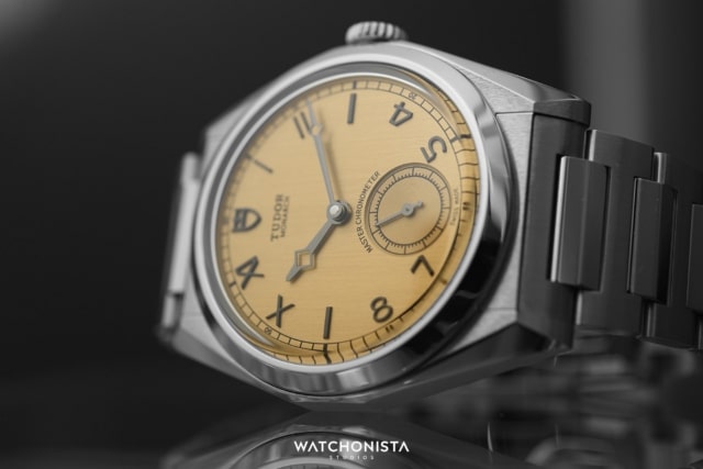
The typography of the modern Monarch was entirely created for this anniversary edition. What makes it extra fun is that the display uses both Roman and Arabic numerals, so you know the designers had twice the fun!
Franck Muller Vanguard Damascus
Another important attribute of typography in high-end watchmaking is that, in many cases, numbers and other information aren’t always simply printed on a dial; more often than not, they are applied. And for its Vanguard Damascus Racing (released last month), Franck Muller has literally sculpted its numerals.
Muller has always used typography in an expressive way – indeed, even with its unique complication, one doesn’t think of the Crazy Hours without picturing its oversized, colorful, and calligraphic numbers, the font for which was inspired by Art Deco and Art Nouveau calligraphic numeral design. In fact, despite the hand-drawn font used for the Crazy Horse (and the more angular version used for the Vanguard), this custom-made, proprietary typeface looks like a curlicue riff on Bruguet’s numeral typography.
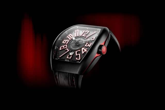
This new edition is crafted from Damascus steel. Even the individual hour markers feature the swirly patterns of this mixed-metal alloy. So instead of using high-contrast colors and lume on its markers to aid readability, the Vanguard Damascus relies on the sculpted depth of the numeral to ensure legibility. Frankly (no pun intended), it’s a game changer for Muller.